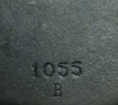
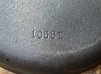
Do the font difference reveal a difference in age between these two otherwise identical skillets?

DougSahady

New member
Two WagnerWare Sidney O #5 skillets. The number and letter fonts appear to be slightly different. I remember a member here previously indicating that the font may indicate later or earlier range manufacture. In the case of these two otherwise identify skillets, does the slightly different font indicate that one is older chronologically than the other? The #5s are the most noticeable difference. The only other notable difference between the two is that one (pictured on left) of the skillets has the grinding swirls and the other is completely smooth. Would appreciate any feedback on if the font can reveal if one of these is older than the other. I’m going to gift one of them to my daughter as a wedding present as she currently uses the one t make her egg breakfast regularly. Thanks very much
 

Attachments

  • 504E8EC1-ADC1-4551-8CF0-6DE57AC7B916.jpeg
    504E8EC1-ADC1-4551-8CF0-6DE57AC7B916.jpeg
    106.1 KB · Views: 9
  • 437C8D3B-1B8B-4A48-BCC4-322598675C57.jpeg
    437C8D3B-1B8B-4A48-BCC4-322598675C57.jpeg
    92.9 KB · Views: 9
The font on these two doesn't seem to date them that far apart. Both, unlike earlier markings, have the look of having been stamped into their aluminum working patterns, rather than carved. The oldest Wagner c/n font is slightly larger, heavier in weight and sans serif. Both the stylized logo and the c/n became thinner and less-deeply incised over time compared to this oldest version:

1668964342962.png
 
The font on these two doesn't seem to date them that far apart. Both, unlike earlier markings, have the look of having been stamped into their aluminum working patterns, rather than carved. The oldest Wagner c/n font is slightly larger, heavier in weight and sans serif. Both the stylized logo and the c/n became thinner and less-deeply incised over time compared to this oldest version:

View attachment 8082
I’ve noticed that all the c/n fonts on the 1408 waffle irons I’ve seen pictures of are heavy in weight and sans serif. I guess Wagner never changed the c/n fonts on them?
 
Wagner discontinued all waffle irons but the 1408 around 1941, and they likely followed soon after. There was probably no reason to consider changing patterns for an item that had become or was becoming obsolete.
 
Back
Top